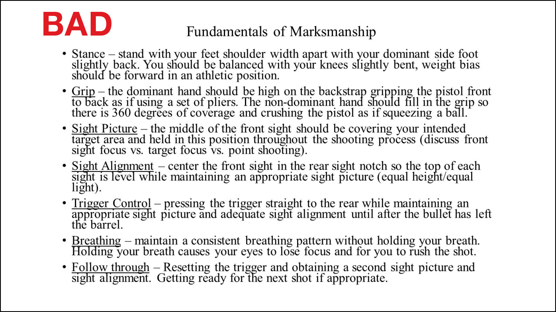

We’ve all been there: You walk into a classroom and the instructor begins class by giving everyone a handout of their PowerPoint presentation. They greet the class and fire up the machine. The first thing they do is introduce themselves using a PowerPoint slide with bullet points outlining their credentials. Next, they go through a dozen slides with more bullet points showing all the performance objectives for the class. By this time, you’re already fighting extreme gravitational pull on your eyelids and begging for the first break so you can mainline some high-octane caffeinated beverage.
Whether you’re an instructor or supervisor or you want to become an instructor or supervisor, the truth is PowerPoint has become a necessary evil. Whether it’s a use-of-force class or a budget presentation, we need to use PowerPoint to get our point across. The problem is that most instructors suck as much at making PowerPoint presentations as PowerPoint sucks the life out of our audiences. It’s time to fix this mess and give our people the better presentations and classes they deserve.
If your PowerPoint is boring, hard to understand and difficult to see, your audience can be assured the rest of your presentation is going to be just as bad.

Death by PowerPoint
Antonio Zarzoza, co-owner of Instructor Z & Associates (instructor-z.com), is the leading PowerPoint instructional design trainer in law enforcement. In addition to being a sworn police officer, he conducts classes on how to maximize the value of PowerPoint in law enforcement presentations. Whether it’s firearms, a budget presentation, crisis intervention training, use of force or a first aid class, Antonio has helped thousands of law enforcement trainers and supervisors improve their PowerPoint game.
Antonio believes death by PowerPoint has evolved to the point where instructors are killing their own presentations and sending students into a PowerPoint-induced coma. Slides with endless lists and bullet points are boring to everyone in class. He points out that when you start working with PowerPoint to build a slide deck, the default style includes a title and bullet points. By doing this, PowerPoint is setting you up to suck.
Instead, Antonio says we have two paths to choose from when we’re building our PowerPoint presentation: We can either teach by default or teach by design. If we teach using the default PowerPoint settings, we will continue down the executioner’s row of PowerPoint casualties. If we teach by design, we can use PowerPoint to influence our audience by creating short but intense emotional experiences to help deliver our message. This is done using movement, contrasting colors and sound to our advantage. An easy way to accomplish this is to use a morph transition in a carousel of pictures to create movement.
There are an endless number of ways to accomplish this, limited only by the imagination of the presenter. A good place to start is with a catchy title to hook people into your class and message. In addition, the opening slide should engage the audience, catch their attention and trigger their emotions. After you have their attention, don’t lose it with a series of slides that make them beg for mercy or presentation skills that are dull and monotonous.

Master the content
A surefire way to lose an audience is to focus the presentation on the PowerPoint and not the instructor. Let’s start with the worst first: the instructor who reads the slides to the audience. This is insulting to everyone in the audience. It’s basically like saying they’re too dumb to read, so the ultra-smart instructor is going to do it for them. The result is a totally disconnected instructor and an audience that feels like the presentation is a colossal waste of time. The purpose of PowerPoint is to support the presentation, not to be the presentation.
Dan Fraser, a retired police officer and the author of Kickass Presentations: Wow Audiences with PowerPoint Slides that Click, Humor that’s Quick, and Messages that Stick (kickasspresentationsbook.com), says, “People are there to see you and to hear what you have to say. This means that you must master your content and have your message dialed in. It also means that the audience should be primarily focused on you — your facial expressions, body language, hand gestures, eye contact, the words you say and how you say them.”
Remember what I said about giving everyone a handout of each bullet point and PowerPoint slide? Every time I’m in a class with an instructor who does this, it takes every bit of self-control I possess to not walk out. Seriously, if you are giving me your class on a handout, why do I need to waste my time in the classroom? I’m pretty sure I can read through your handout of slides faster than you can read them off the screen to me. And you’re welcome — I just saved you from eight hours of embarrassment!
Part of mastering your content is mastering the timing and progress of your PowerPoint presentation. When using video or transitioning between topics, insert some inconspicuous cue prompts in the slide preceding your video or topic transition. This helps avoid a surprise or rough spot in the delivery. These cues can be a camera or play button as a reminder about the upcoming video, or it can be some other sort of symbol to indicate a topic change. This will help keep your presentation smooth and seamless as if you’ve done it a thousand times.

Avoiding the reaper
There are several helpful guidelines to break you out of the PowerPoint slump. First, remember slides are free. PowerPoint doesn’t charge an extra fee if you use additional slides. Instead of dumping a bunch of words on one slide, keep it down to one message per slide. If you insist on using bullet points on a slide, use less than six bullets per slide. Too many bullet points and words make the slide hard to read, moving the focus of the presentation to the screen and not the presenter.
On this note, text should be no smaller than 36-point font. And for crying out loud, stop using Times New Roman! I swear, if I’m in your class and you use Times New Roman, I will mock you incessantly, take photos of your slides and share them on social media. This may sound extreme, but it’s the only way I’ll stay awake while you’re escorting me to the PowerPoint gallows.
Instead of relying on endless text and bullet points, Fraser believes in the superiority of pictures over text. He says research going back to the 1970s shows memory is more robust when people see images compared to just words. Advertisers know this, which is why billboards have pictures on them and only a few words. The image and a few select words stick with your audience, while slides filled with words will elicit yawns of disapproval.
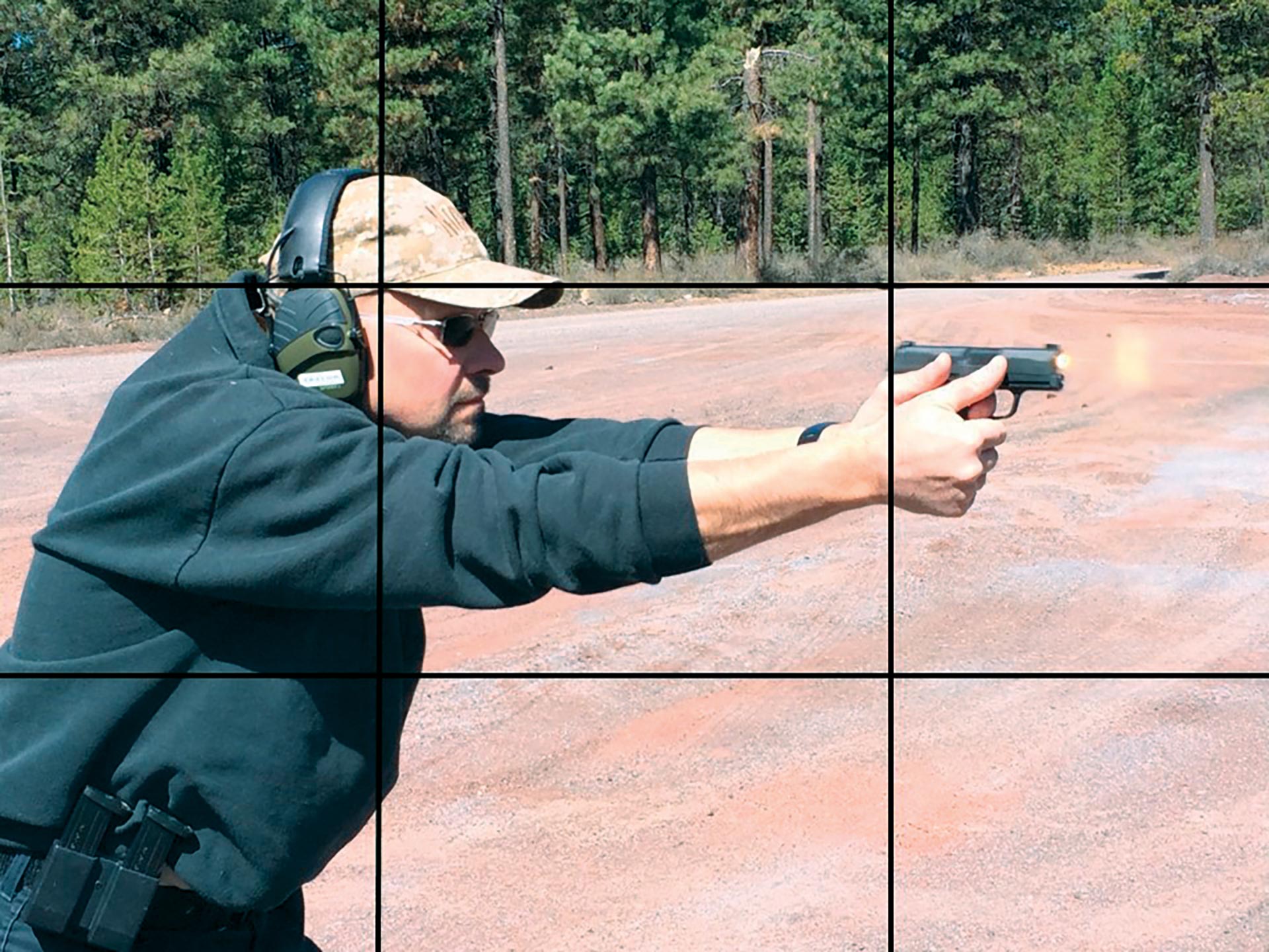
When using pictures, get the highest-quality images possible. There are several websites that offer free stock images, but if you can’t find just the right one, take your own photos. In Kickass Presentations, Fraser says if you decide to take your own photographs, do it using the rule of thirds, where an image is divided into thirds horizontally and vertically. The subject of the image is placed at the intersection of the dividing lines or along one of the lines to create tension, energy and more interesting compositions. According to Dan, professional photographers and designers eat, sleep and breathe the rule of thirds.
Whether you’re teaching a class, making a proposal to command staff or presenting a budget to the city council, the quality of your presentation is a direct reflection on you. If your PowerPoint is boring, hard to understand and difficult to see, your audience can be assured the rest of your presentation is going to be just as bad. On the other hand, if your PowerPoint elicits emotion and grabs their attention, your audience is primed to listen and learn. A professional presentation shows the audience that you respect the privilege of their time and attention.
As seen in the January 2024 issue of American Police Beat magazine.
Don’t miss out on another issue today! Click below:


